
Another imaging session with the 4.5″ APO refractor under very good seeing conditions.
This time I’ve played a bit with the filters to see which is better for lunar imaging. What I have “discovered” is presented below, but before that, I will begin with some basic grayscale images. The diversity of the results impose a chapter-like presentation, so this post will have it’s own three sections.
Chapter I: Grayscale lunar images.
The following are for sure my best images using the Teleskop Service 115mm F/7 apochromatic refractor. Not only that I had some luck with very good seeing conditions (8/10) but also because the experimental imaging session proved to me that using a distinct filter (the blue) reveals details smaller compared to my usual red-light imaging.
The entire setup used for the first images: TS APO 115 F/7 Refractor, Baader Hyperion 2.25x Barlow lens (at 3x), ZWO ASI120MM camera, and Baader CCD blue filter.
And the images:
The lunar South Pole and crater Moretus. The image has some rather good resolution, being one of my best-looking images of this area. It can actually be compared with some other views acquired with my ex-scope, the Celestron C11 (280mm) under less favorable seeing conditions (4/10).

Mare Humorum with crater Gassendi. Another image comparable with some of my earlier C11-made views of this area. There are some small rimae visible in and around Gassendi.

Sinus Iridum and Plato. This view shows crater Plato with some of the smaller craterlets on it’s floor, but also the detectable inner rima inside Vallis Alpes. Not bad for a 4.5″ instrument!

Crater Bullialdus. This image shows Bullialdus in the upper-right corner and a lot of rilles and other formations, like double-craters (lower-right, Hesiodus A crater).

Chapter II: Which filter shows the finest details
I was saying at the beginning of this post that I will comment a bit about something I’ve “discovered” for myself: choosing the blue filter for best details. Well, besides a brief link regarding angular resolution as a “fast-explanation” about how the smallest details in the visible spectrum are obtained in blue light, I can also comment a bit about my optical setup.
There are actually a few reasons that allow smaller details to be obtained in blue light compared to green or red light. The first one is the degree of optical correction of the instrument’s objective lenses, in my case a refractor. Despite it’s name “APO” this does not mean that there are no chromatic aberrations or other optical defects in the system. There are, and maybe they are small but for high-resolution images of the Moon or planets, the smallest defects are always going to be visible in one way or the other. This could be one reason why the red images show blurry contours and none of the smallest details present in the green and blue images. Another reason might be the filters themselves. And I’m sure that this contributes to the blurry aspect of the red images. The Baader CCD Red filter allows for some infrared light to pass through, which means that a large domain of the visible-to-near-infrared spectrum gets to the CMOS sensor of the ASI120MM camera, which is actually fairly sensitive in the NIR (Near InfraRed). Of course, as many amateur astronomers know, the red-infrared domain is best for bad seeing conditions, the atmosphere being much more permeable to this part of the spectral domain, and thus allowing for some good images to be obtained despite not-perfect seeing conditions. But, as I’ve mentioned earlier (with a link), red light means a lower level of detail compared to blue light.
So, the two choices, without speaking about the green which is in the middle, are: blue filter for very good seeing conditions, and red filter for less good seeing conditions.
And because this imaging session (and a few others in the days before) was conducted in very good seeing conditions, I’ve selected the blue filter for most of the images. But I’ve also acquired a few other sequences using all three filters for some RGB lunar imagery, and at the end of this “chapter” I can present an interesting result, which proves that the “blue-light method” is the way to go with such a setup (TS APO refractor+Baader blue filter+ASI120MM camera):

Chapter III: Colors of the Moon
And now for the final results of this sessions.
As I was saying earlier, I did manage to acquire some RGB data for some lunar regions. I’ve chose the LRGB method, which implies using one of the color channels as Luminance (in my case it was the blue channel due to better details obtained using the blue filter) and afterwards overlaying the RGB data onto it. The RGB data was highly-saturated to better show the color differences.
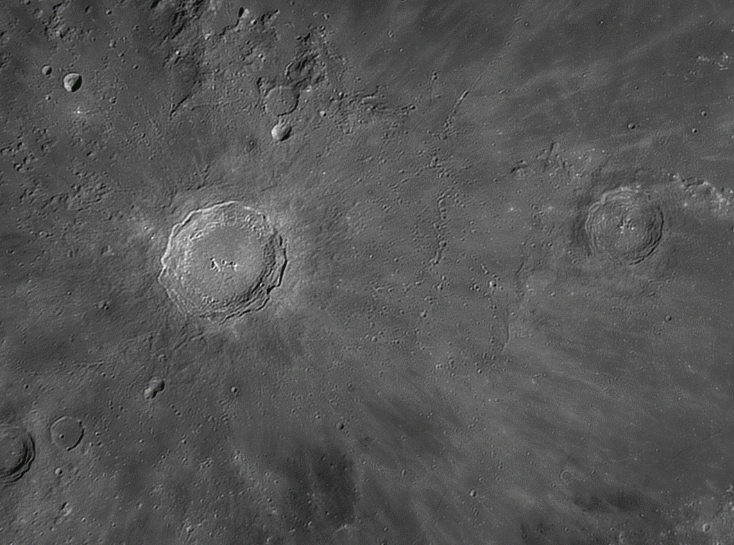
The first image is of Copernicus. It shows a lot of colors depicting different materials being ejected from the impact onto the floor of the nearby mare.

But since this session was all about experiments, I’ve over-saturated the colors a bit more (a lot more actually) and reprocess the image entirely, the result being a bit “eye-damaging” but presenting more information in terms of crater rays morphology.

A short animation showing the transition from grayscale to colors for Copernicus:
The second color data set is of the Bullialdus area.
First, a grayscale image:

And the LRGB version:

Again, a lot of interesting information can be extracted from the color data, such as the yellowish floor of Bullialdus being of a different material from the rest of the surrounding area, and blue rays from Tycho crossing close-by. Interesting is also the dark-brown patch at one end of Rima Birt, as are some reddish spots near and in crater Birt. I’m not an expert in lunar geology to be able to comment on all of this different colors and their associated features, but I can realize that there is a lot more information on this type of images (LRGB) compared to simple grayscale ones.
UPDATE: The last two images were combined together by Chuck Wood and selected as the LPOD for November 15, 2014.
I can only hope for some good seeing again soon, to capture and create some new LRGB lunar images with the refractor.
Max
(November 13, 2014)

u made 1 fantastic job!!!! ur descriptions r essential 4 myself 2 understand more from ur great work
thx 4 that
good luck
Thank you for the kind words! Glad you’ve liked the post and the information regarding the images.